How to Design YouTube Thumbnails That Get Clicks in 2026
A viewer decides in about a second whether your video looks worth opening. That decision is made from the thumbnail and the title together, and the thumbnail does most of the visual work. Learning how to make YouTube thumbnails is therefore not about fancy art. It is about making one clear promise that a viewer can grasp on a small phone screen. This guide gives you a design system, current upload rules, a mobile test, and an honest way to test results.
In this guide
- What a thumbnail must do in one second
- The one subject rule
- Text, colour, and contrast
- Sizes, formats, and upload steps
- A worked redesign example
- AI thumbnails and the evidence rule
- How to test thumbnails fairly
- Policy and clickbait checks
Step 1: Know what the thumbnail must do
A thumbnail has one job. It must make the right viewer stop, grasp the video promise, and feel that the video is for them. It does not need to tell the whole story. The title, the first minute, and the video itself do that work. When a thumbnail tries to show three ideas at once, the viewer grasps none of them and scrolls past.
Think of the thumbnail and the title as one promise, split across two parts. The thumbnail shows the feeling, the subject, or the result. The title gives the detail in words. They should support each other without repeating the same words. For example, a thumbnail that shows a surprised face beside a broken phone works with a title that explains the repair. A thumbnail that repeats the full title in small text wastes space and hurts legibility. For title writing in depth, read how to write YouTube titles.
Judge every thumbnail by this question. Could a new viewer who has never seen your channel tell, in one second, what the video is about and why it might help them. If the answer is no, the design is not ready, even if it looks polished at full size.
Step 2: Use one dominant subject
Pick one main subject for each thumbnail. That subject can be a face, a product, a place, or a clear action. Make it large and place it where the eye lands first. Remove or blur everything else that fights for attention. A busy background, a second face, and three objects all pull the eye in different directions, and the viewer leaves before choosing one.
Faces work well when the emotion matches the video. A clear expression, such as surprise, focus, or delight, tells the viewer how to feel about the topic. The face must be large, well lit, and facing the viewer or the action. If your channel has no faces, use one strong object or result instead. A finished cake, a repaired phone, or a tidy desk can carry the same job, as long as it is large and clear.
Step 3: Keep text short and readable
Use 2 to 5 words of text on a thumbnail. Short text can be read at a glance. Long text shrinks, blurs, and competes with the title. Choose words that add feeling or contrast to the title, not words that repeat it. For example, if the title says "How I fixed my phone in 20 minutes", the thumbnail text could say "It worked" or "Fixed at last". Those words add a result the title does not state in full.
Use a bold, simple font with thick letters. Avoid thin scripts and decorative fonts that break at small sizes. Put text on a plain area of the image, or add a soft shadow or dark panel behind it, so the letters stay clear. Check contrast by squinting at the thumbnail. If the text melts into the background when you squint, the contrast is too weak. Colour contrast matters for viewers with low vision too, so do not rely on colour alone to carry meaning. Pair colour with size, position, and a clear shape.
Step 4: Use colour and contrast with purpose
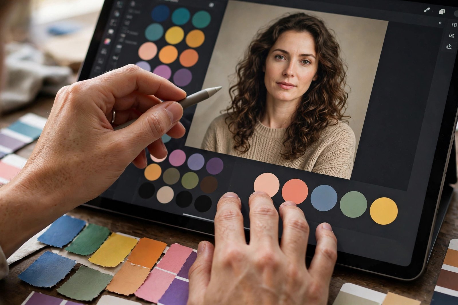
Colour should guide the eye, not decorate the image. Use one strong colour for the main subject or the text, and keep the rest of the image calmer. High contrast between the subject and the background helps the subject stand out. A bright subject on a dark background, or a dark subject on a light background, both work, as long as the gap between them is clear.
Avoid colour pairs that are hard to tell apart for colour blind viewers, such as red text on green, when that pair carries the main message. Test the thumbnail in greyscale. If the main subject still stands out without colour, the design is strong. If it disappears, the design relied too much on colour and needs a stronger shape or contrast.
Step 5: Sizes, formats, and upload steps
Size rules cause confusion because guides quote different numbers. The official Help page recommends a high resolution for videos, while many guides use 1280 by 720 pixels as the widely used export size. Treat 1280 by 720 as a practical export size for a 16:9 video thumbnail, and export at a higher resolution when your tool allows it, so the image stays sharp on large screens. For Shorts, use a vertical 9:16 image. Check the current limits on the official YouTube Help page for custom thumbnails before you upload, because file size limits differ between desktop and mobile uploads.
Upload steps on a computer in YouTube Studio are simple. Open the video details, find the thumbnail section, and upload your image or pick a generated option. For a Short, custom thumbnails can be added in YouTube Studio on a computer for a verified account, at 9:16. For Shorts creation steps, see the official YouTube Help page on creating Shorts. That rule corrects older guides that said a separate Shorts thumbnail could not be set. If your account is not verified, complete verification first, because custom thumbnails need it.
Keep safe margins in mind. The bottom right corner can be covered by the video length label, and other corners can be covered by icons on some screens. Keep text and the main subject away from the edges and the bottom right corner. Leave a clear margin around the whole image, so nothing important is cut off on a phone feed.
| Thumbnail type | Shape | Practical export size | Key check |
|---|---|---|---|
| Long video | 16:9 | 1280 by 720 pixels | Text clear at phone size |
| Short | 9:16 | Vertical, full height | Subject clear in the centre |
| Vertical video thumbnail | 16:9 custom may be replaced | Check Studio preview | Preview on home and watch pages |
Step 6: A worked redesign example
Imagine a weak thumbnail for a video about fixing a phone screen. The weak version shows a desk with a phone, tools, a mug, and a plant, plus the text "How to fix your cracked phone screen at home step by step". At phone size, the phone is small, the text is unreadable, and the viewer cannot tell what the video promises.
The strong version keeps one subject. It shows a large phone with a clear crack, held in a hand, against a plain dark background. The text says "Fixed in 20 minutes" in large bold letters, placed away from the bottom right corner. The title gives the full method, the thumbnail gives the result. Nothing else fights for attention. This example is described, not taken from a real channel, and it shows the method rather than a proven result. Your own redesign should follow the same steps. Remove, enlarge, shorten, then check at phone size.
Step 7: Use AI thumbnails without misleading viewers
AI tools can speed up thumbnail work. They can make backgrounds, suggest layouts, and create many rough options fast. A useful workflow is to write the video hook first, pick one main subject, generate 6 to 12 rough options, judge them at thumbnail size, then add text outside the generator and check safe margins. Judge at small size, because a thumbnail that looks good large can fail small.
Keep an evidence rule. If the video shows a real result, a real product, or a real place, the thumbnail should not invent a different result. You can edit a real frame, generate only the background, or use a recurring illustrated style, but each choice has a trade off. A fully generated scene may look polished, yet it can mislead viewers if it shows something the video does not contain. Do not use a real person's face in a generated image without permission. Publicity and likeness rules apply, and a tool output does not grant you that permission. When in doubt, use your own photo, a product shot, or a clear illustration that does not pretend to be a photo of a real event.
Step 8: Test thumbnails fairly
Testing tells you whether a change helped, but only when the test is fair. YouTube allows testing of thumbnail variants, judged by watch time share rather than clicks alone. That matters, because a thumbnail that earns clicks but loses viewers fast is not a good thumbnail. Test meaningfully different options, not near identical copies. A new colour shade alone teaches you little. A new subject, a new emotion, or a new promise teaches you more.
Run one test at a time per video, and give it enough time, often up to about two weeks, before you judge it. Do not change the title at the same time, or you will not know whether the thumbnail or the title caused the change. Record the start date, the variants, and the result. A test that changes clicks but drops watch time should not be called a win. Keep the variant that brings both clicks and staying viewers.
Step 9: The 1 second mobile test
Before you publish, run this quick test. Shrink the thumbnail to about the width it will have in a phone feed. Show it to yourself for one second, then hide it. Write down what you remember. If you remember the subject and the promise, the thumbnail passes. If you remember only a colour or a blur, it fails. Repeat the test after each fix, and stop when the promise survives the one second view.
What it costs and what to expect
You can make strong thumbnails with free tools. Canva, Adobe Express, and similar tools offer free plans with templates and fonts. Paid plans add stock images and brand tools, but they are not required to start. The main cost is time. Plan 20 to 40 minutes per thumbnail at first, including ideas, design, and the mobile test. That time should fall as you build templates.
Common mistakes
- Showing three subjects instead of one clear subject.
- Using more than 5 words of text on the thumbnail.
- Repeating the full title word for word in the thumbnail text.
- Placing text in the bottom right corner where the time label covers it.
- Judging the thumbnail only at full size on a computer.
- Using a misleading image that the video does not deliver.
- Changing the title and the thumbnail at the same time during a test.
- Copying a popular thumbnail style without matching it to your own video promise.
Risks and limitations
Misleading thumbnails break trust and can break platform rules. YouTube bans thumbnails with nudity, sexually provocative content, hate speech, violence, and harmful content, and it can turn off custom thumbnails or apply strikes for policy breaches. Always check the current policy on the official Help page before you publish a borderline design. A thumbnail that overpromises may earn a click, but it will lose the viewer, damage the channel, and teach the feed that your videos disappoint. Honest thumbnails grow slower at first, but they keep the viewers they earn.
Frequently asked questions
What size should a YouTube thumbnail be
For a long video, a 16:9 image exported at 1280 by 720 pixels is the widely used practical size, while the official Help page recommends a higher resolution for sharp display. For a Short, use a vertical 9:16 image. Always check the current file size limits on the official Help page, because desktop and mobile limits differ, and rules change.
How many words should a thumbnail have
Use 2 to 5 words of text. Short text stays readable on a phone and adds feeling or a result that the title does not repeat. Longer text shrinks at feed size and competes with the title. If your message needs more words, put the extra detail in the title, not in the thumbnail.
Can I use AI to make YouTube thumbnails
Yes, you can use AI for backgrounds, rough options, and layout ideas, but add text outside the generator and check spelling yourself. Do not use AI to fake a result, a product, or a person that the video does not show. A generated image does not give you permission to use a real person's likeness, and a misleading thumbnail can hurt trust and break platform rules.
How do I test a thumbnail
Test meaningfully different variants, one test at a time, and judge by watch time share, not clicks alone. Give the test enough time, often up to about two weeks, and do not change the title at the same time. Record the variants and the result, so the next thumbnail learns from the test instead of repeating it.
Should the thumbnail and title say the same thing
No, they should make one promise together without repeating the same words. Let the thumbnail show the subject, feeling, or result, and let the title give the detail. When both parts repeat each other, you waste space that could have added a new reason to click. For title help, read how to write YouTube titles.
Conclusion
A strong thumbnail is simple, honest, and readable in one second. Pick one subject, use short text, build strong contrast, keep safe margins, and test at phone size before you publish. Then test fairly, learn from watch time as well as clicks, and keep the style that earns staying viewers. For your next steps, read how to write YouTube titles, how to make YouTube videos that get views, and the full YouTube Earning category page.